
Table of Contents
The Best Productivity Dashboards for Teams in 2026
Because in a world drowning in data, the real productivity hack is knowing what truly matters.
Introduction: The Dashboard Dilemma
Imagine this: It’s 9:15 a.m. on a Monday. Your remote team’s Slack is buzzing, your project tracker shows 14 overdue tasks, and your marketing manager just dropped “one more thing” into the sprint board. You open five tabs, trying to make sense of it all — and realize you’ve spent 20 minutes looking for clarity before you’ve even started working.
That’s the modern productivity paradox.
We have more tools than ever — yet often, less focus.
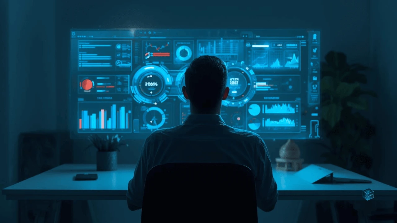
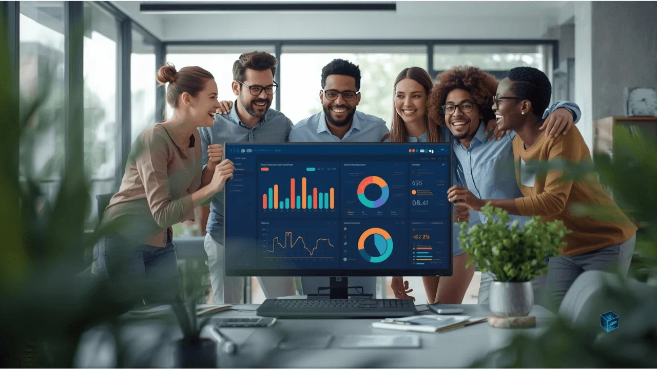
Enter the Productivity Dashboard: your team’s digital cockpit. In 2026, these aren’t just static project boards. They’re living, breathing systems powered by AI, designed to predict bottlenecks, visualize goals, and even coach you into better workflows.
Let’s explore the tools that are quietly running the world’s most efficient teams — and how your business can harness them too.
The Evolution of Productivity Dashboards (2020–2026)
Once upon a time (okay, around 2020), a “dashboard” was a glorified spreadsheet. You’d manually log hours, tick checkboxes, and pray that everyone remembered to update the status column.
Fast forward to 2026, and dashboards have evolved into command centers for digital collaboration.
They now:
- Integrate seamlessly with Slack, Google Workspace, and CRM tools.
- Use AI prediction models to forecast deadlines and workloads.
- Offer real-time performance insights across remote teams.
- Include emotion tracking and burnout prevention metrics (yes, really).
As work shifted hybrid and remote, teams needed a single source of truth — not just for tasks, but for morale, goals, and growth. That’s where modern dashboards stepped in.
Think of them as your team’s GPS: they don’t just tell you where you are, but suggest the fastest route to your next milestone — even if you didn’t know you needed one.
The Top Contenders of 2026
Let’s meet the leaders shaping the productivity landscape this year — and what makes each uniquely powerful.
Notion AI Dashboards: The All-in-One Brain
Notion has always been the darling of flexible teams. But in 2026, Notion AI Dashboards turned it into something else entirely — an intelligent workspace that feels more like an assistant than a tool.
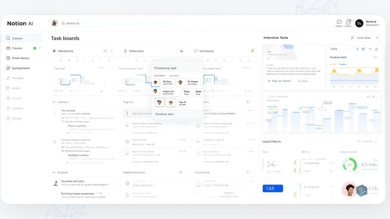
You can say, “Show me our Q4 goals and the biggest blockers by department,” and it’ll generate a live dashboard with predictive insights. It even recommends task redistribution to balance workloads across your team.
Best For: Teams that value flexibility and creative workflows.
Standout Feature: AI-generated dashboards built from natural language prompts.
Human Touch: Its warm, minimal design feels like digital zen — perfect for reducing cognitive overload.
ClickUp 4.0: The Command Center
If Notion is a zen garden, ClickUp 4.0 is mission control at NASA.
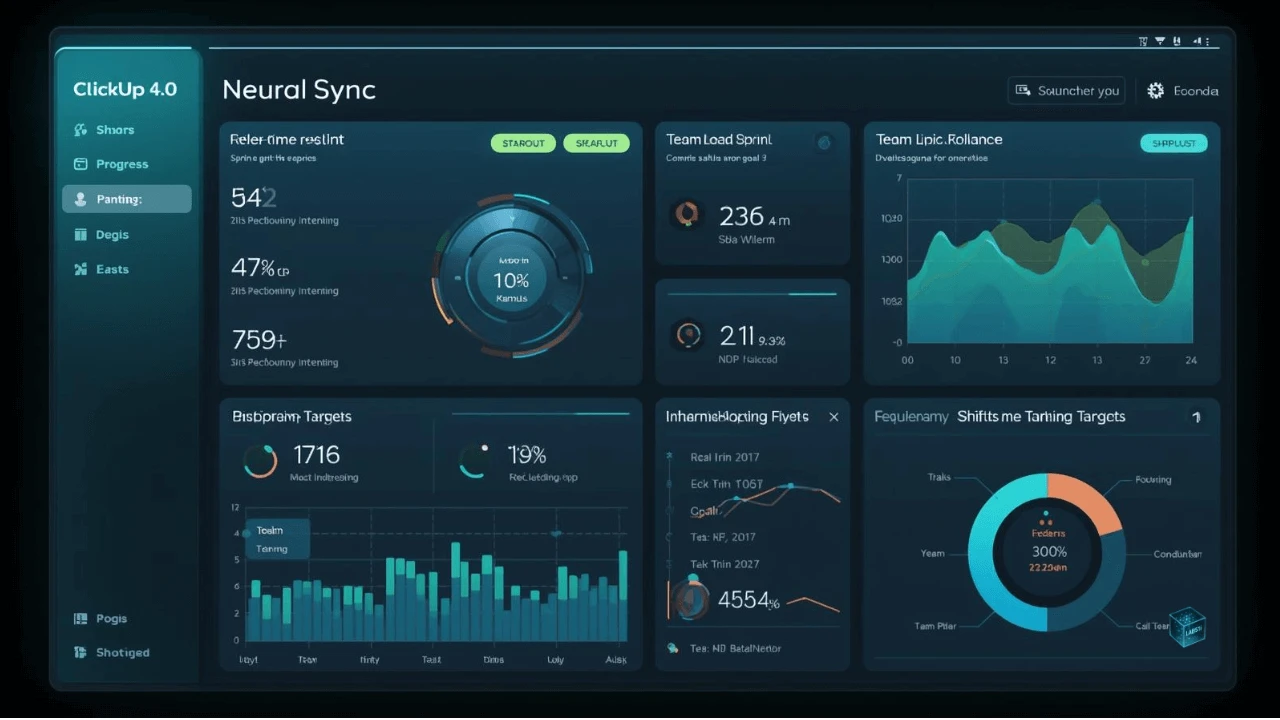
It’s built for teams that want precision, automation, and accountability. ClickUp’s 2026 update brought neural sync — an AI system that tracks team activity patterns and auto-adjusts goals in real-time. For example, if a developer spends 20% more time in bug fixes, ClickUp recalibrates sprint goals and notifies the manager.
Best For: Agile teams, tech startups, and data-driven managers.
Standout Feature: Neural Sync for adaptive sprint and workload balancing.
Human Touch: Despite its complexity, the UX feels surprisingly intuitive — like your team’s second brain, not a micromanager.
Monday.com Neural Boards: The Visual Thinker’s Paradise
Monday.com always nailed the visual side of project management — bright, colorful boards that made progress feel satisfying. In 2026, they took it further with Neural Boards, an AI-powered visualization suite.
These boards don’t just show you progress; they suggest visualizations to help you understand it better. Think mood-based dashboards that change tone when performance dips or an “energy map” showing which teams need a morale boost.
Best For: Creative agencies, marketing teams, and visual learners.
Standout Feature: Emotion-driven data visualization and dynamic morale mapping.
Human Touch: The dashboard literally reacts to your team’s energy — it’s analytics with empathy.
Linear Flow: The Minimalist’s Dream
While most dashboards pile on features, Linear Flow wins hearts by doing the opposite.
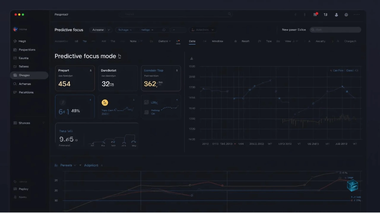
Designed for speed and clarity, it’s built around the idea that less is more. Linear uses subtle AI suggestions, seamless keyboard shortcuts, and distraction-free tracking to keep you focused on deep work.
Best For: Product teams, engineers, and those allergic to clutter.
Standout Feature: Predictive focus mode — it hides non-urgent tasks when you’re in a deep work session.
Human Touch: Feels like a well-designed notebook — quiet, fast, and refreshingly simple.
Real-World Impact: Dashboards That Actually Work
Dashboards aren’t about aesthetics — they’re about alignment.
Take NovaLink, a small cybersecurity startup based in Singapore. They switched from Trello to ClickUp 4.0 earlier this year. Within three months, their average project turnaround dropped from 10 days to 6, and employee overtime decreased by 22%.
Or Studio Bloom, a remote design collective that built its entire client pipeline on Notion AI. The founder describes it as “a living map of our studio — we don’t just track tasks, we track our rhythm.”
When dashboards are used well, they create flow — that elusive state where teams move with clarity, confidence, and shared purpose.
Because productivity isn’t about doing more. It’s about knowing what not to do.
The AI Factor: From Tracking to Coaching
The biggest leap from 2020 to 2026 isn’t prettier charts — it’s intelligence.
AI dashboards now act less like tools and more like coaches. They observe your patterns, highlight inefficiencies, and even suggest behavioral changes.
- “You’ve spent 70% of your time on low-priority tasks this week. Want to rebalance?”
- “Based on your team’s meeting load, tomorrow afternoon is best for deep work.”
- “Design team burnout risk: rising — consider redistributing deadlines.”
It’s like having a manager who cares about your mental bandwidth.
Some worry this crosses into creepy territory — after all, who wants software analyzing their emotional state? But the best dashboards of 2026 strike a balance: insight without intrusion.
Used right, AI doesn’t replace human intuition — it amplifies it.
Choosing the Right Dashboard for Your Team
Choosing a productivity dashboard today is like picking a diet: everyone swears theirs is the best, but what works depends on your habits, team size, and goals.
Here’s a quick guide to finding your fit:
| Team Type | Best Dashboard | Why It Works |
|---|---|---|
| Small startups | Notion AI | Adaptable, affordable, and flexible for growth. |
| Remote teams | ClickUp 4.0 | Handles async workflows and AI-powered tracking. |
| Creative agencies | Monday.com Neural Boards | Visual-first design fosters collaboration. |
| Tech/product teams | Linear Flow | Minimalist focus boosts coding productivity. |
| Enterprise-scale teams | Asana Quantum (honorable mention) | Deep integrations and advanced analytics. |
Tip: Before adopting one, ask:
“Does this dashboard make my team feel in control — or controlled?”
That single question reveals more about tool alignment than any feature checklist.
The Future of Work Visualization
What’s next after dashboards?
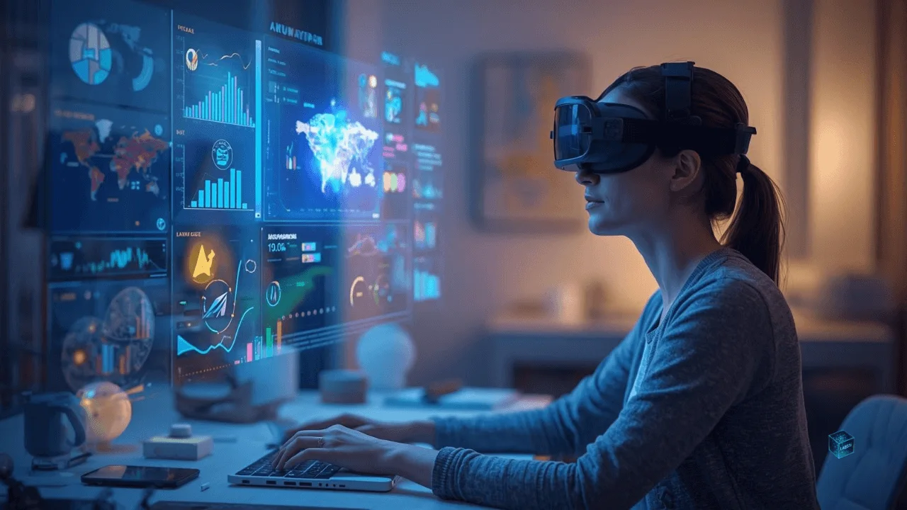
By late 2026, we’re already seeing immersive productivity hubs — think AR dashboards projected into your workspace, or holographic data rooms where managers can literally “walk through” their project pipeline.
AI will soon move from interpreting data to storytelling with data. Your dashboard won’t just say, “Sales are down 12%.” It’ll narrate:
“Sales dropped in Week 2 due to campaign overlap. Moving the next push by 3 days should increase conversion by 9%.”
That’s not data — that’s dialogue.
And as we march toward an era of hyper-automation, the most successful teams won’t be the ones using the most complex dashboards.
They’ll be the ones using the most human ones — systems that blend empathy with analytics.
Conclusion: The Dashboard That Understands You
Here’s the truth: a productivity dashboard is only as powerful as the people behind it.
In 2026, the best dashboards don’t just organize data — they organize attention. They don’t just show what’s next — they show why it matters.
Whether you’re managing a five-person startup or a global team, the right dashboard gives you something priceless: clarity without chaos.
So before you open yet another tab, ask yourself:
“Is my current system helping my team move forward — or just making us feel busy?”
Because the future of productivity isn’t about working harder or tracking tighter.
It’s about working smarter, together, with dashboards that finally understand what makes us human.
In 2026, productivity dashboards aren’t just tools.
They’re going to become teammates — quietly guiding your team toward focus, flow, and fulfillment.
FAQ
Frequently Asked Questions
A productivity dashboard is a digital hub that helps teams visualize progress, track goals, and streamline workflows. In 2026, these dashboards go beyond checklists — they use AI to forecast deadlines, detect burnout, and even suggest smarter work habits.
Older dashboards were static — you had to manually update them. Today’s dashboards are intelligent ecosystems. They connect to your communication tools, analyze patterns in real time, and adapt automatically when your team’s priorities shift.
Notion AI Dashboards stand out for small teams because of their flexibility and affordability. You can build custom workspaces that grow with your company while letting AI surface insights without overwhelming your team.
AI-driven dashboards don’t just report numbers — they interpret them. They can suggest when to schedule deep work sessions, identify overload risks, or recommend redistributing tasks before burnout hits. Think of it as a data-driven teammate with empathy.
Most major tools (like ClickUp and Notion) now follow strict GDPR and SOC 2 compliance, giving teams full control over data sharing and permissions. The key is transparency — ensure your dashboard clearly shows what data it uses and why.
Expect immersive experiences — AR dashboards, voice-assisted reports, and even AI storyboards that narrate your team’s progress like a timeline. The future is about turning cold data into warm storytelling that keeps teams emotionally connected to their goals.
Surprisingly, yes. Modern dashboards like Monday.com Neural Boards use emotion-driven design — color shifts, progress animations, and morale meters — to make productivity feel rewarding, not robotic. When data feels human, motivation follows.

